Data Analysis with Pandas#
Information |
Details |
|---|---|
Learning Objectives |
• Load and explore power system datasets |
Prerequisites |
Basic Python, NumPy arrays, power system concepts |
Estimated Time |
60 minutes |
Topics |
DataFrames, indexing (loc/iloc), time series, data cleaning, aggregation |
Introduction#
Power systems generate vast amounts of time-series data from SCADA systems, energy markets, weather stations, and smart meters. This lesson introduces Pandas, Python’s primary data manipulation library, through practical power system applications. You’ll learn to handle the structured, time-indexed data that characterizes power system operations.
Pandas excels at the data manipulation tasks you’ll encounter daily in power systems analysis. Whether you’re calculating system reliability metrics, processing market settlements, or analyzing generator performance, Pandas provides the essential tools for efficient data analysis. We’ll focus on the fundamental operations you need most, building your skills progressively through realistic examples while highlighting common pitfalls that can trip up even experienced users.
Setting Up#
import pandas as pd
import numpy as np
import matplotlib.pyplot as plt
import warnings
warnings.filterwarnings('ignore')

# Set display options
pd.set_option('display.max_columns', 10)
pd.set_option('display.precision', 2)

print(f"Pandas version: {pd.__version__}")
Pandas version: 2.3.2
Creating Sample Power System Data#
To learn Pandas effectively, we need realistic power system data. Let’s create datasets representing common data types you’ll encounter: generation output from different units, system load measurements, and market prices. These datasets will exhibit typical patterns like daily load cycles and the relationship between demand and price.
# Create 24 hours of 5-minute data
np.random.seed(42)
timestamps = pd.date_range('2024-01-01', periods=288, freq='5min')

# Base generation values for different units
coal_base = 350  # MW
gas_base = 150   # MW
wind_base = 50   # MW
solar_max = 60   # MW peak
# Generate realistic patterns
generation_data = pd.DataFrame({
    'timestamp': timestamps,
    'coal': coal_base + np.random.normal(0, 5, 288),
    'gas': gas_base + 50 * np.sin(np.linspace(0, 4*np.pi, 288)),
    'wind': np.maximum(0, wind_base + np.random.normal(0, 20, 288)),
    'solar': solar_max * np.maximum(0, np.sin(np.linspace(0, np.pi, 288)))**2
})

print("Sample generation data:")
print(generation_data.head())
print(f"\nDataFrame shape: {generation_data.shape}")
Sample generation data:
            timestamp    coal     gas   wind     solar
0 2024-01-01 00:00:00  352.48  150.00  55.62  0.00e+00
1 2024-01-01 00:05:00  349.31  152.19  37.55  7.19e-03
2 2024-01-01 00:10:00  353.24  154.37  45.84  2.88e-02
3 2024-01-01 00:15:00  357.62  156.55  40.14  6.47e-02
4 2024-01-01 00:20:00  348.83  158.71  38.21  1.15e-01

DataFrame shape: (288, 5)
The generation data shows typical patterns for each technology. Coal provides steady baseload power with minimal variation. Gas units follow load, ramping up and down throughout the day. Wind varies randomly, reflecting the intermittent nature of wind resources. Solar follows a predictable daily pattern, peaking at midday.
Now let’s create corresponding load and price data to complete our dataset:
# Create load data with daily pattern
base_load = 600  # MW
daily_pattern = 100 * np.sin(np.linspace(-np.pi/2, 3*np.pi/2, 288))
load = base_load + daily_pattern + np.random.normal(0, 10, 288)

load_data = pd.DataFrame({
    'timestamp': timestamps,
    'system_load': load
})
# Create price data correlated with load
base_price = 30  # $/MWh
load_factor = (load - load.min()) / (load.max() - load.min())
prices = base_price + 20 * load_factor + np.random.normal(0, 2, 288)

price_data = pd.DataFrame({
    'timestamp': timestamps,
    'lmp': prices
})

print(f"Load range: {load.min():.0f} - {load.max():.0f} MW")
print(f"Price range: ${prices.min():.2f} - ${prices.max():.2f}/MWh")
Load range: 485 - 714 MW
Price range: $28.31 - $53.01/MWh
Working with DataFrames#
DataFrames are the core data structure in Pandas, perfect for the tabular data common in power systems. Each column represents a different measurement or variable, while rows represent observations at different times. Let’s explore how to load, examine, and manipulate this data.
Key Concept: DataFrame Structure
A DataFrame is like a spreadsheet in memory. Rows have an index (labels for each row), and columns have names. Understanding this dual-labeling system is crucial for effective data manipulation.
# Save and reload data (simulating real file operations)
generation_data.to_csv('generation.csv', index=False)
gen_df = pd.read_csv('generation.csv', parse_dates=['timestamp'])

print("DataFrame shape:", gen_df.shape)
print("\nData types:")
print(gen_df.dtypes)
DataFrame shape: (288, 5)

Data types:
timestamp    datetime64[ns]
coal                float64
gas                 float64
wind                float64
solar               float64
dtype: object
Notice that Pandas automatically recognized the timestamp column as a datetime when we used parse_dates. This is crucial for time-series operations. The shape tells us we have 288 time periods (5-minute intervals over 24 hours) and 5 columns.
Let’s explore the data more thoroughly using Pandas’ built-in methods:
# Basic exploration
print("Statistical summary:")
print(gen_df.describe())

print("\nTime range:")
print(f"Start: {gen_df['timestamp'].min()}")
print(f"End: {gen_df['timestamp'].max()}")
Statistical summary:
                 timestamp    coal     gas    wind   solar
count                  288  288.00  288.00  288.00  288.00
mean   2024-01-01 11:57:30  349.94  150.00   49.51   29.90
min    2024-01-01 00:00:00  333.79  100.00    0.57    0.00
25%    2024-01-01 05:58:45  346.45  114.84   36.11    8.73
50%    2024-01-01 11:57:30  350.26  150.00   49.60   29.84
75%    2024-01-01 17:56:15  353.08  185.16   62.46   51.04
max    2024-01-01 23:55:00  369.26  200.00  111.58   60.00
std                    NaN    4.98   35.36   19.22   21.29

Time range:
Start: 2024-01-01 00:00:00
End: 2024-01-01 23:55:00
Setting the Index#
For time-series data, setting the timestamp as the index enables powerful time-based operations. This is a fundamental step that transforms how you can work with the data, allowing for easy time-based selection, resampling, and alignment of different datasets.
Warning: Index Changes Access Patterns
After setting a datetime index, you can no longer use integer positions directly with square brackets. Use .iloc[0] for position-based access or .loc['2024-01-01'] for label-based access.
Before setting index#
print("Before setting index:")
print(gen_df.head(3))
print(f"\nAccessing row 0: gen_df.iloc[0]['coal'] = {gen_df.iloc[0]['coal']:.2f}")
Before setting index:
            timestamp    coal     gas   wind     solar
0 2024-01-01 00:00:00  352.48  150.00  55.62  0.00e+00
1 2024-01-01 00:05:00  349.31  152.19  37.55  7.19e-03
2 2024-01-01 00:10:00  353.24  154.37  45.84  2.88e-02

Accessing row 0: gen_df.iloc[0]['coal'] = 352.48
After setting timestamp as index#
# Set timestamp as index
gen_df = gen_df.set_index('timestamp')
load_df = load_data.set_index('timestamp')
price_df = price_data.set_index('timestamp')

print("After setting timestamp index:")
print(gen_df.head(3))
After setting timestamp index:
                       coal     gas   wind     solar
timestamp
2024-01-01 00:00:00  352.48  150.00  55.62  0.00e+00
2024-01-01 00:05:00  349.31  152.19  37.55  7.19e-03
2024-01-01 00:10:00  353.24  154.37  45.84  2.88e-02
Access patterns after setting index#
WRONG:
gen_df[0]- This raises KeyError!RIGHT:
gen_df.iloc[0]- Access by positionRIGHT:
gen_df.loc['2024-01-01 00:00:00']- Access by label
# Demonstrate correct access patterns
print("Access by position (iloc):")
print(gen_df.iloc[0])  # First row
print()
print("Access by label (loc):")
print(gen_df.loc['2024-01-01 00:00:00'])  # Specific timestamp
Access by position (iloc):
coal     352.48
gas      150.00
wind      55.62
solar      0.00
Name: 2024-01-01 00:00:00, dtype: float64

Access by label (loc):
coal     352.48
gas      150.00
wind      55.62
solar      0.00
Name: 2024-01-01 00:00:00, dtype: float64
DataFrame Indexing and Selection#
Understanding how to select data from DataFrames is crucial but often confusing for beginners. Pandas provides multiple ways to access data, each with specific use cases. Let’s explore the main methods and their differences.
Key Indexing Methods
.loc[]- Label-based selection (use index/column names).iloc[]- Integer position-based selection (like array indexing).at[]- Fast scalar label-based access.iat[]- Fast scalar position-based access[]- Column selection or boolean filtering
Column Selection - The Simplest Method#
Single column (returns Series):#
gen_df['coal'].head(3)
timestamp
2024-01-01 00:00:00    352.48
2024-01-01 00:05:00    349.31
2024-01-01 00:10:00    353.24
Name: coal, dtype: float64
Multiple columns (returns DataFrame):#
gen_df[['coal', 'gas']].head(3)
| coal | gas | |
|---|---|---|
| timestamp | ||
| 2024-01-01 00:00:00 | 352.48 | 150.00 |
| 2024-01-01 00:05:00 | 349.31 | 152.19 |
| 2024-01-01 00:10:00 | 353.24 | 154.37 |
loc (label-based) vs iloc (position-based)#
Using loc with timestamp label:#
gen_df.loc['2024-01-01 01:00:00', 'coal'] # Specific cell
np.float64(351.2098113578302)
Using iloc with integer positions:#
gen_df.iloc[12, 0] # Row 12 (13th row), column 0 (coal)
np.float64(351.2098113578302)
Slicing with loc (inclusive of end):#
gen_df.loc['2024-01-01 00:00:00':'2024-01-01 00:10:00', 'coal']
timestamp
2024-01-01 00:00:00    352.48
2024-01-01 00:05:00    349.31
2024-01-01 00:10:00    353.24
Name: coal, dtype: float64
Slicing with iloc (exclusive of end):#
gen_df.iloc[0:3, 0] # First 3 rows, first column
timestamp
2024-01-01 00:00:00    352.48
2024-01-01 00:05:00    349.31
2024-01-01 00:10:00    353.24
Name: coal, dtype: float64
at and iat for Fast Scalar Access#
Using at (label-based):#
print(f"Coal at 2024-01-01 00:00:00: {gen_df.at['2024-01-01 00:00:00', 'coal']:.2f}")
Coal at 2024-01-01 00:00:00: 352.48
Using iat (position-based):#
print(f"Value at position [0, 0]: {gen_df.iat[0, 0]:.2f}")
Value at position [0, 0]: 352.48
Common Pitfall: Boolean Indexing
When filtering data with conditions, always use .loc[] for setting values to avoid the SettingWithCopyWarning. Never chain operations when modifying data.
Boolean Indexing - RIGHT and WRONG Ways#
WRONG - Chained assignment:
demo_df[demo_df['coal'] > 360]['coal'] = 360 # Don't do this!
RIGHT - Using loc with boolean mask:
# Create a copy for demonstration
demo_df = gen_df.copy()

# RIGHT way - using loc with boolean mask
mask = demo_df['coal'] > 360
demo_df.loc[mask, 'coal'] = 360
print(f"Capped {mask.sum()} values above 360 MW")
print(f"New max coal: {demo_df['coal'].max():.2f} MW")
Capped 8 values above 360 MW
New max coal: 360.00 MW
Time-based Selection#
morning_gen = gen_df.between_time('06:00', '12:00')
print(f"Morning generation averages:")
print(morning_gen.mean())
Morning generation averages:
coal     349.74
gas      118.73
wind      52.68
solar     49.18
dtype: float64
Partial string indexing (very convenient for time series):#
gen_df.loc['2024-01-01 06:00':'2024-01-01 06:30', 'solar']
timestamp
2024-01-01 06:00:00    30.16
2024-01-01 06:05:00    30.82
2024-01-01 06:10:00    31.48
2024-01-01 06:15:00    32.13
2024-01-01 06:20:00    32.79
2024-01-01 06:25:00    33.44
2024-01-01 06:30:00    34.09
Name: solar, dtype: float64
Data Cleaning#
Real power system data often contains quality issues from communication failures, sensor errors, or data collection problems. Common issues include missing values from SCADA dropouts and unrealistic measurements from faulty sensors. Let’s learn how to identify and handle these problems.
Best Practice: Always Copy When Cleaning
When cleaning data, work on a copy (df.copy()) to preserve the original. This prevents accidental data loss and allows you to compare before/after.
# Create data with quality issues
messy_data = gen_df.copy()  # Always work on a copy!

# Introduce missing values (SCADA dropout)
dropout_times = np.random.choice(messy_data.index[50:100], size=5)
messy_data.loc[dropout_times, 'wind'] = np.nan

# Introduce unrealistic value
messy_data.iloc[150, 2] = -50  # Negative wind generation

print(f"Missing values by column:")
print(messy_data.isnull().sum())
print(f"\nNegative wind values: {(messy_data['wind'] < 0).sum()}")
Missing values by column:
coal     0
gas      0
wind     4
solar    0
dtype: int64

Negative wind values: 1
Missing values and unrealistic measurements can corrupt your analysis if not handled properly. For time-series data, interpolation often provides a reasonable estimate for short gaps. For unrealistic values, domain knowledge helps identify and correct problems.
Warning: SettingWithCopyWarning
If you see SettingWithCopyWarning, it means you’re trying to modify a view of the data rather than the data itself. This often happens with chained operations. Always use .copy() when creating subsets you plan to modify.
SettingWithCopyWarning Demonstration#
WRONG - Creating a view (can cause warnings):
subset_wrong = messy_data[messy_data['coal'] > 350]
print(f"Is this a view? {subset_wrong._is_view}")
# subset_wrong['coal'] = 350  # This would trigger SettingWithCopyWarning!
Is this a view? False
RIGHT - Creating a copy:
subset_right = messy_data[messy_data['coal'] > 350].copy()
subset_right['coal'] = 350  # This is safe
print(f"Modified {len(subset_right)} rows safely")
Modified 148 rows safely
Clean the Data Properly#
clean_data = messy_data.copy()

# Fix negative values
negative_mask = clean_data['wind'] < 0
clean_data.loc[negative_mask, 'wind'] = 0  # Use loc for safe assignment

# Interpolate missing values (linear for small gaps)
clean_data['wind'] = clean_data['wind'].interpolate(method='linear', limit=3)

print(f"Remaining missing values: {clean_data.isnull().sum().sum()}")
print(f"Wind generation range: {clean_data['wind'].min():.1f} - {clean_data['wind'].max():.1f} MW")
Remaining missing values: 0
Wind generation range: 0.0 - 111.6 MW
Time Series Operations#
Power system data is inherently temporal, and you’ll frequently need to change time resolutions or calculate rolling statistics. Resampling converts data between different time frequencies, while rolling calculations help identify trends and smooth noisy measurements.
Performance Tip: Vectorization
Pandas operations are optimized for entire columns. Avoid iterating over rows with iterrows() unless absolutely necessary. Vectorized operations can be 100x faster.
Vectorization vs Iteration Performance#
import time

# SLOW - Iterating over rows
start = time.time()
total_slow = 0
for idx, row in gen_df.iterrows():
    total_slow += row['coal'] + row['gas']
time_slow = time.time() - start

# FAST - Vectorized operation
start = time.time()
total_fast = (gen_df['coal'] + gen_df['gas']).sum()
time_fast = time.time() - start

print(f"Iteration time: {time_slow*1000:.2f} ms")
print(f"Vectorized time: {time_fast*1000:.2f} ms")
print(f"Speedup: {time_slow/time_fast:.1f}x faster")
Iteration time: 2.37 ms
Vectorized time: 0.13 ms
Speedup: 18.4x faster
Resampling Data#
# Resample to hourly (average for power, sum for energy)
gen_hourly = gen_df.resample('1h').mean()  # Use lowercase 'h' in newer pandas
energy_hourly = gen_df.resample('1h').sum() / 12  # Convert to MWh

print(f"Original: {len(gen_df)} five-minute periods")
print(f"Resampled: {len(gen_hourly)} hourly periods")
print("\nHourly averages (MW):")
print(gen_hourly.head(3))
print(f"\nMemory usage comparison:")
print(f"Original: {gen_df.memory_usage().sum() / 1024:.1f} KB")
print(f"Hourly: {gen_hourly.memory_usage().sum() / 1024:.1f} KB")
Original: 288 five-minute periods
Resampled: 24 hourly periods

Hourly averages (MW):
                       coal     gas   wind  solar
timestamp
2024-01-01 00:00:00  351.48  161.79  52.55   0.30
2024-01-01 01:00:00  347.04  184.28  53.30   2.25
2024-01-01 02:00:00  349.03  197.52  59.16   6.11

Memory usage comparison:
Original: 19.4 KB
Hourly: 0.9 KB
Rolling Calculations#
# Calculate 30-minute rolling average
gen_df['coal_smooth'] = gen_df['coal'].rolling(window=6).mean()

# Note about the first few values
print("First few values of rolling average:")
print(gen_df[['coal', 'coal_smooth']].head(8))
print("\nNotice: First 5 values are NaN (window=6)")
First few values of rolling average:
                       coal  coal_smooth
timestamp
2024-01-01 00:00:00  352.48          NaN
2024-01-01 00:05:00  349.31          NaN
2024-01-01 00:10:00  353.24          NaN
2024-01-01 00:15:00  357.62          NaN
2024-01-01 00:20:00  348.83          NaN
2024-01-01 00:25:00  348.83       351.72
2024-01-01 00:30:00  357.90       352.62
2024-01-01 00:35:00  353.84       353.37

Notice: First 5 values are NaN (window=6)
# Plot to visualize
plt.figure(figsize=(10, 4))
gen_df['coal'][:50].plot(label='Actual', alpha=0.5)
gen_df['coal_smooth'][:50].plot(label='30-min Average')
plt.ylabel('Generation (MW)')
plt.title('Rolling Average Smoothing')
plt.legend()
plt.show()
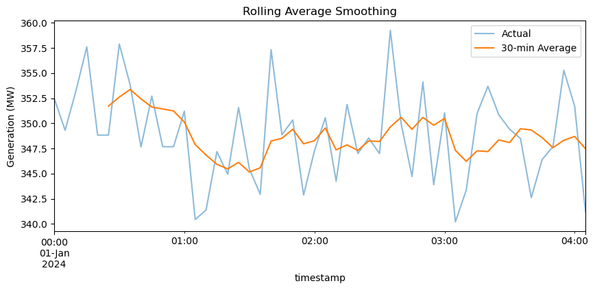
The rolling average smooths out short-term fluctuations, revealing the underlying trend. This technique is valuable for identifying patterns in noisy data and calculating metrics like moving average prices or rolling standard deviations for volatility analysis.
Note: Rolling Window Edge Effects
Rolling operations produce NaN values for the first (window-1) periods by default. Use min_periods parameter if you need values for these initial periods.
Aggregation and Grouping#
Analyzing data by categories reveals important patterns in power system operations. You might need to compare generation by fuel type, analyze load patterns by hour of day, or calculate statistics by different time periods. The groupby operation is fundamental to these analyses.
Memory Tip: GroupBy Objects
GroupBy operations don’t immediately compute results - they create a GroupBy object that computes results lazily. This saves memory when working with large datasets.
# Add hour column for grouping
gen_df['hour'] = gen_df.index.hour

# Create GroupBy object (no computation yet)
grouped = gen_df.groupby('hour')
print(f"GroupBy object: {grouped}")
print(f"Number of groups: {grouped.ngroups}")

# Now compute specific aggregations
hourly_avg = grouped[['coal', 'gas', 'wind', 'solar']].mean()

print("\nAverage generation by hour (first 6 hours):")
print(hourly_avg.head(6))
GroupBy object: <pandas.core.groupby.generic.DataFrameGroupBy object at 0x79e0bd390bf0>
Number of groups: 24

Average generation by hour (first 6 hours):
        coal     gas   wind  solar
hour
0     351.48  161.79  52.55   0.30
1     347.04  184.28  53.30   2.25
2     349.03  197.52  59.16   6.11
3     348.34  197.94  50.50  11.61
4     350.24  185.43  41.28  18.36
5     350.73  163.36  49.53  25.92
Multiple Aggregations#
agg_stats = gen_df.groupby('hour')['wind'].agg(['mean', 'std', 'min', 'max'])
print("Wind statistics by hour:")
print(agg_stats.head())
Wind statistics by hour:
       mean    std    min    max
hour
0     52.55  12.35  36.14  67.99
1     53.30  13.75  33.42  75.55
2     59.16  15.52  33.64  91.85
3     50.50  16.48  25.72  73.16
4     41.28  12.65  21.04  58.26
# Visualize hourly patterns
plt.figure(figsize=(10, 4))
hourly_avg.plot(kind='bar', stacked=True)
plt.xlabel('Hour of Day')
plt.ylabel('Generation (MW)')
plt.title('Average Hourly Generation Mix')
plt.legend(title='Source')
plt.tight_layout()
plt.show()
<Figure size 1000x400 with 0 Axes>
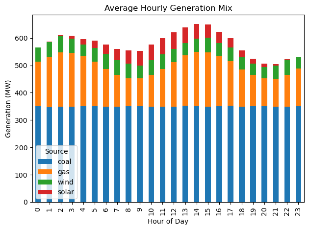
The stacked bar chart clearly shows how the generation mix changes throughout the day. Solar peaks at midday, gas ramps up during high-demand periods, and coal provides steady baseload. This type of analysis helps operators understand system patterns and plan resources.
Merging Datasets#
Power system analysis often requires combining data from multiple sources. You might need to merge generation data with prices to calculate revenues, or combine load data with weather to analyze correlations. Pandas provides several merge operations for different scenarios.
Warning: Merge Key Duplicates
If your merge keys have duplicates, the result will contain all combinations (Cartesian product), potentially exploding memory usage. Always check for duplicates with df.index.duplicated().sum() before merging.
Checking for Duplicate Indices#
print(f"Generation duplicates: {gen_df.index.duplicated().sum()}")
print(f"Load duplicates: {load_df.index.duplicated().sum()}")
print(f"Price duplicates: {price_df.index.duplicated().sum()}")
print("\nSafe to merge!")
Generation duplicates: 0
Load duplicates: 0
Price duplicates: 0

Safe to merge!
Merge Types Comparison#
# Inner join (default) - only matching indices
inner_merge = gen_df.merge(load_df, left_index=True, right_index=True, how='inner')
print(f"Inner merge shape: {inner_merge.shape}")

# Left join - all from left, matching from right
left_merge = gen_df.merge(load_df, left_index=True, right_index=True, how='left')
print(f"Left merge shape: {left_merge.shape}")

# Check memory usage
print(f"\nMemory usage after merge: {inner_merge.memory_usage().sum() / 1024:.1f} KB")
Inner merge shape: (288, 7)
Left merge shape: (288, 7)

Memory usage after merge: 25.0 KB
Merge All Datasets#
# Merge all datasets
system_data = gen_df.merge(load_df, left_index=True, right_index=True)
system_data = system_data.merge(price_df, left_index=True, right_index=True)

# Calculate total generation
system_data['total_gen'] = system_data[['coal', 'gas', 'wind', 'solar']].sum(axis=1)

print("Merged system data:")
print(system_data[['total_gen', 'system_load', 'lmp']].head())
print(f"\nFinal shape: {system_data.shape}")
Merged system data:
                     total_gen  system_load    lmp
timestamp
2024-01-01 00:00:00     558.10       502.36  30.29
2024-01-01 00:05:00     539.05       507.73  31.21
2024-01-01 00:10:00     553.48       485.31  30.60
2024-01-01 00:15:00     554.37       511.65  33.00
2024-01-01 00:20:00     545.87       503.77  32.96

Final shape: (288, 9)
# Analyze relationships
correlation = system_data[['system_load', 'lmp', 'total_gen']].corr()
print("Correlation matrix:")
print(correlation)

# Calculate generator revenues
system_data['coal_revenue'] = system_data['coal'] * system_data['lmp'] / 12
print(f"\nTotal coal revenue: ${system_data['coal_revenue'].sum():,.2f}")
Correlation matrix:
             system_load   lmp  total_gen
system_load         1.00  0.95       0.46
lmp                 0.95  1.00       0.44
total_gen           0.46  0.44       1.00

Total coal revenue: $338,804.42
The merged dataset enables comprehensive analysis. We can see the correlation between load and price, calculate revenues for each generator, and analyze the supply-demand balance. This integrated view is essential for market analysis and system planning.
Common Pitfalls and Solutions#
Let’s address the most common issues that trip up Pandas users, especially when working with power system data.
1. View vs Copy Problem#
Critical Concept: Views vs Copies
Some Pandas operations return a view (reference to original data) while others return a copy (independent data). Modifying a view can unexpectedly change the original data or fail silently.
original = gen_df[['coal', 'gas']].copy()

# This might be a view or copy (unpredictable!)
subset_unclear = original[original['coal'] > 350]

# This is definitely a copy
subset_copy = original[original['coal'] > 350].copy()

# This is definitely a view
subset_view = original.loc[original['coal'] > 350]

print(f"Original shape: {original.shape}")
print(f"Subset shape: {subset_copy.shape}")
print("\nAlways use .copy() when you need independent data!")
Original shape: (288, 2)
Subset shape: (148, 2)

Always use .copy() when you need independent data!
2. Chained Assignment Problem#
WRONG way (chained):
test_df[test_df['coal'] > 360]['coal'] = 360
# This may not work and triggers SettingWithCopyWarning!
RIGHT way (using loc):
test_df = gen_df.copy()
mask = test_df['coal'] > 360
test_df.loc[mask, 'coal'] = 360
print(f"Successfully capped {mask.sum()} values")
Successfully capped 8 values
3. Memory Optimization#
print("Original memory usage:")
print(gen_df.memory_usage(deep=True))

# Optimize data types
optimized = gen_df.copy()
optimized['hour'] = optimized['hour'].astype('int8')  # Hours only need 0-23

print("\nOptimized memory usage:")
print(optimized.memory_usage(deep=True))
print("\nMemory saved by using int8 for hour column!")
Original memory usage:
Index          10600
coal            2304
gas             2304
wind            2304
solar           2304
coal_smooth     2304
hour            1152
dtype: int64

Optimized memory usage:
Index          10600
coal            2304
gas             2304
wind            2304
solar           2304
coal_smooth     2304
hour             288
dtype: int64

Memory saved by using int8 for hour column!
4. Timezone Handling#
print(f"Current timezone: {gen_df.index.tz}")
print("(None means timezone-naive)\n")

# Make timezone-aware
gen_tz = gen_df.copy()
gen_tz.index = gen_tz.index.tz_localize('US/Eastern')
print(f"After localization: {gen_tz.index.tz}")

# Convert to different timezone
gen_utc = gen_tz.copy()
gen_utc.index = gen_utc.index.tz_convert('UTC')
print(f"After conversion: {gen_utc.index.tz}")
print(f"\nFirst timestamp in Eastern: {gen_tz.index[0]}")
print(f"Same moment in UTC: {gen_utc.index[0]}")
Current timezone: None
(None means timezone-naive)

After localization: US/Eastern
After conversion: UTC

First timestamp in Eastern: 2024-01-01 00:00:00-05:00
Same moment in UTC: 2024-01-01 05:00:00+00:00
Performance Considerations#
When working with large power system datasets (millions of rows), performance becomes critical. Here are key strategies for optimization.
Performance Best Practices
Use vectorized operations instead of loops
Select columns early to reduce memory usage
Use appropriate data types (int8 for small integers, category for repeated strings)
Chunk large files when reading with
chunksizeparameterUse numba or cython for complex calculations that can’t be vectorized
Performance Comparison: apply() vs vectorization#
# Create larger dataset for testing
large_df = pd.concat([gen_df] * 10, ignore_index=True)
print(f"Test dataset size: {len(large_df)} rows\n")

# Method 1: Using apply (slower)
start = time.time()
result_apply = large_df.apply(lambda row: row['coal'] * 0.95 if row['hour'] < 6 else row['coal'], axis=1)
time_apply = time.time() - start

# Method 2: Vectorized with np.where (faster)
start = time.time()
result_vector = np.where(large_df['hour'] < 6, large_df['coal'] * 0.95, large_df['coal'])
time_vector = time.time() - start

print(f"apply() time: {time_apply*1000:.2f} ms")
print(f"Vectorized time: {time_vector*1000:.2f} ms")
print(f"Speedup: {time_apply/time_vector:.1f}x faster")
Test dataset size: 2880 rows

apply() time: 6.69 ms
Vectorized time: 0.28 ms
Speedup: 23.9x faster
Troubleshooting Guide#
Here are solutions to the most common errors you’ll encounter:
Common Errors and Solutions
KeyError: Column/index doesn’t exist → Check with
.columnsor.indexSettingWithCopyWarning: Modifying a view → Use
.copy()or.loc[]ValueError: cannot reindex: Index mismatch in operations → Check index alignment
MemoryError: Dataset too large → Use chunks or optimize dtypes
AttributeError: Method doesn’t exist → Check Pandas version or typo
Troubleshooting Examples#
# 1. Safely check if column exists
column_to_check = 'voltage'
if column_to_check in gen_df.columns:
    print(f"Column '{column_to_check}' exists")
else:
    print(f"Column '{column_to_check}' not found")
    print(f"Available columns: {list(gen_df.columns)}")

print()

# 2. Safely handle potential missing values
safe_mean = gen_df['wind'].fillna(0).mean()
print(f"Safe mean (treating NaN as 0): {safe_mean:.2f}")

# 3. Check data types before operations
print("\nData types:")
print(gen_df.dtypes)
Column 'voltage' not found
Available columns: ['coal', 'gas', 'wind', 'solar', 'coal_smooth', 'hour']

Safe mean (treating NaN as 0): 49.51

Data types:
coal           float64
gas            float64
wind           float64
solar          float64
coal_smooth    float64
hour             int32
dtype: object
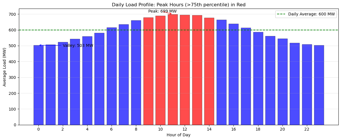
Exercise 1: Load Analysis#
Load patterns directly influence electricity prices and determine when peaking generators must be dispatched. In this exercise, you’ll analyze the daily load profile to identify critical operational periods.
Using the load_df dataset, calculate the average load for each hour of the day using groupby operations. Identify peak hours as those with load above the 75th percentile of hourly averages. Create a visualization that clearly distinguishes peak hours from off-peak hours using color coding (red for peak, blue for off-peak). Add a horizontal line showing the overall daily average load for reference. Finally, determine the specific hours when the system experiences its highest and lowest average demand.
Hint
First, calculate hourly averages using groupby() with the hour attribute from the index. Use the quantile(0.75) method on your hourly averages to find the peak threshold.
Solution to Exercise 1#
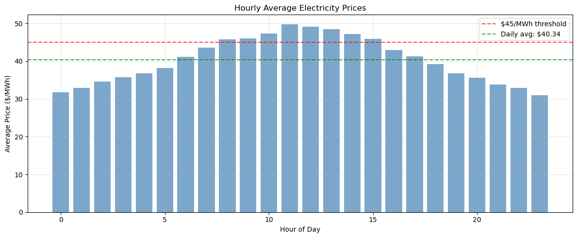
Exercise 2: Price Statistics with Safe Operations#
In this exercise, you’ll analyze the statistical properties of electricity prices throughout the day. Start by calculating comprehensive statistics (mean, min, max, standard deviation) on price_df for each hour using groupby operations with the describe() method. Identify the five most expensive hours based on average price using the nlargest() method. Then determine what percentage of time prices exceed $45/MWh, which might trigger demand response or peaking generation. Throughout this analysis, use proper indexing with .loc[] and work on copies to avoid SettingWithCopyWarning issues.
For identifying price spikes, calculate the mean and standard deviation of all prices, then find periods where prices exceed the mean by more than two standard deviations. This statistical approach helps distinguish genuine price spikes from normal market volatility.
Hint
Use groupby().describe() to get all statistics at once, then select specific columns as needed. The nlargest(5, 'mean') method will find your top hours. For percentage calculations, remember that (condition).mean() * 100 gives you the percentage directly. When filtering for spikes, create your mask first, then use .loc[mask] for safe selection.
Solution to Exercise 2#
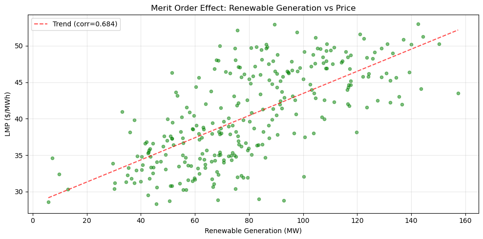
Exercise 3: Renewable Integration Analysis with Performance#
Calculate the renewable penetration percentage (wind + solar as percentage of total generation) for each time period in the dataset. Find when maximum renewable penetration occurs and analyze the relationship between renewable generation and electricity prices. Compare the performance of using apply() versus vectorized operations for these calculations.
Create a scatter plot showing renewable generation versus price, calculate the correlation coefficient, and interpret what this relationship tells us about the merit order effect in electricity markets.
Hint
Use vectorized operations (df['wind'] + df['solar']) instead of apply() for much better performance. For the scatter plot, use plt.scatter(). To add a trend line, you can use np.polyfit() and np.poly1d() (search documentation if needed) or simply observe the pattern visually. The correlation can be calculated with .corr() method.
Solution to Exercise 3#
Performance Comparison#
Summary#
We went through essential Pandas operations with applications to power system data. You understand the difference between loc and iloc, know how to avoid the SettingWithCopyWarning, and can optimize performance through vectorization.
The key skills developed include proper DataFrame indexing, safe data cleaning practices, efficient time-series operations, and performance-optimized aggregations. Most importantly, you’ve learned to avoid the common pitfalls that can lead to incorrect results or poor performance.
As you work with real power system data, remember these critical points: always use .copy() when you need independent data, prefer vectorized operations over loops, use .loc[] for safe value assignment, and check for duplicates before merging. With these skills and awareness of common pitfalls, you are prepared to handle analysis on dataframes.
Final Best Practices Checklist
Use
.copy()when creating subsets you’ll modifyUse
.loc[]for label-based selection and assignmentUse
.iloc[]for position-based selectionVectorize operations instead of using loops
Check for duplicates before merging
Set appropriate data types to save memory
Handle missing values explicitly
Be aware of timezone issues in time series
# Clean up
import os
if os.path.exists('generation.csv'):
    os.remove('generation.csv')
print("Cleanup complete")
Cleanup complete

